Chartfleau Blog
Data visualization, finance, and programming
Get notified of new content ->
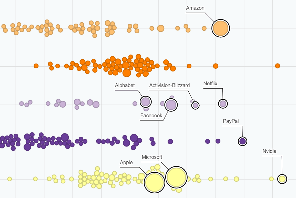
S&P 500 Bubble Chart
An interactive swarm chart showing returns for all S&P 500 companies organized by sector. Created with JavaScript and D3.js. Updated daily.
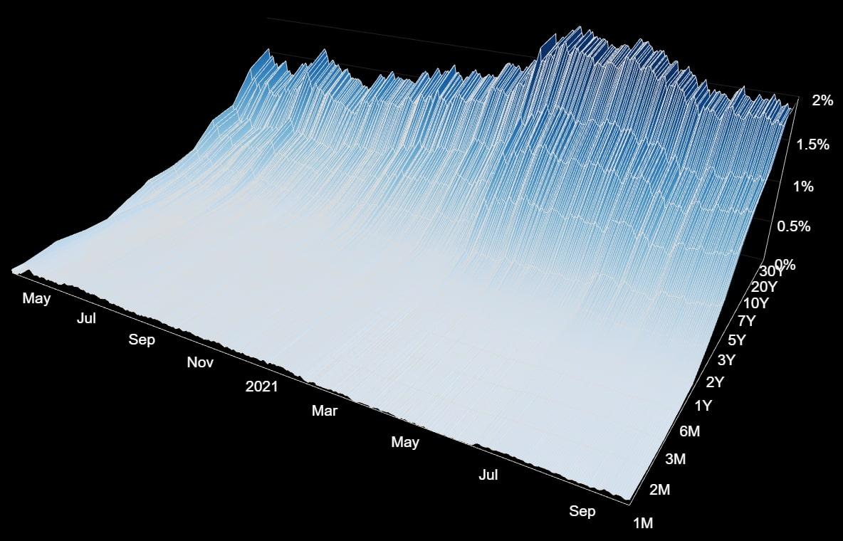
The Yield Curve
A 3D model of the US yield curve, with camera controls for rotation, panning and zooming. Toggle between daily or monthly data. Created with Three.js and D3.js.
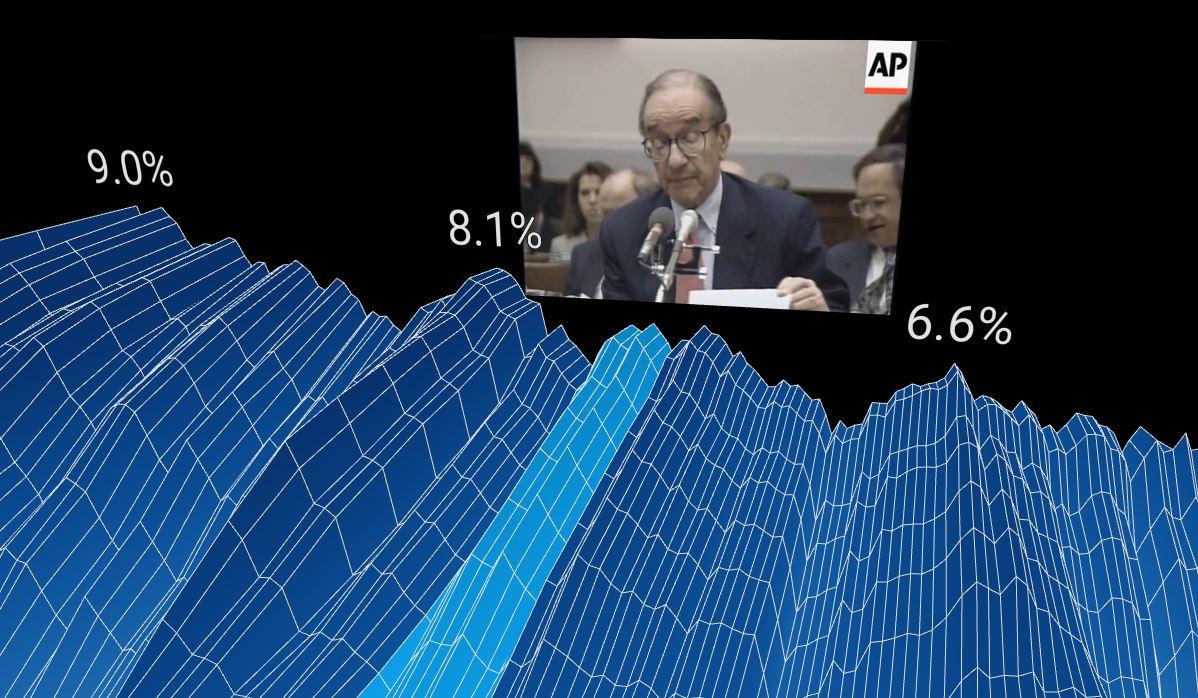
Historical Interest Rates
An animated history of the U.S. yield curve. Implements scroll controls to advance the camera using Three.js with react-three-fibre. Includes HTML5 video captions and sound.
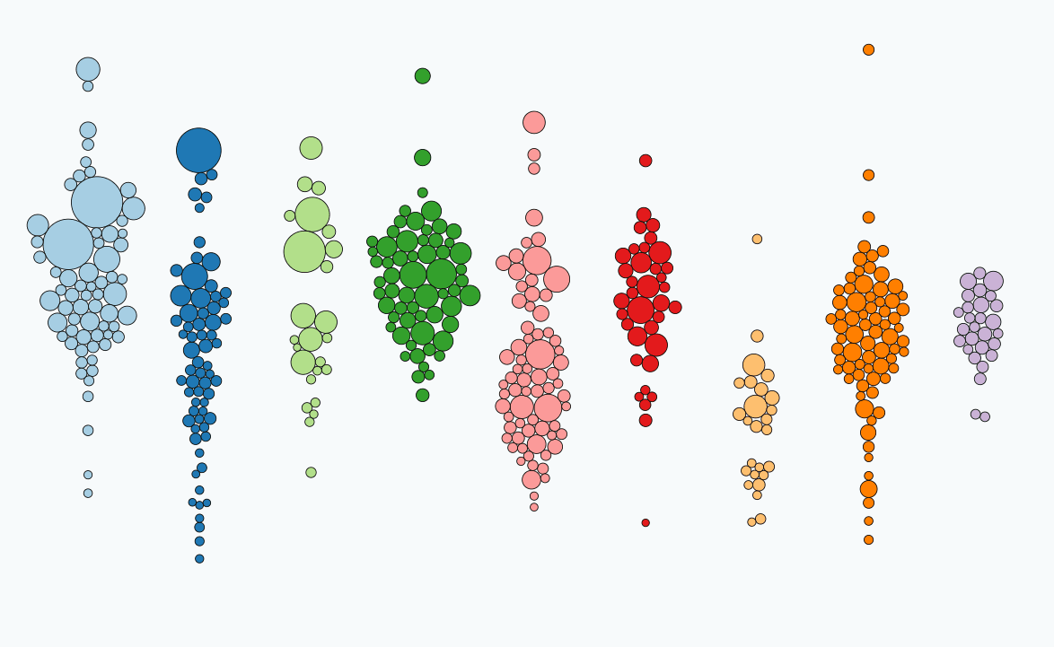
D3 Swarm Plot Tutorial
A guide to making a swarm or "beeswarm" chart using Javascript and D3. Written for those who already know some Javascript and the D3 basics.
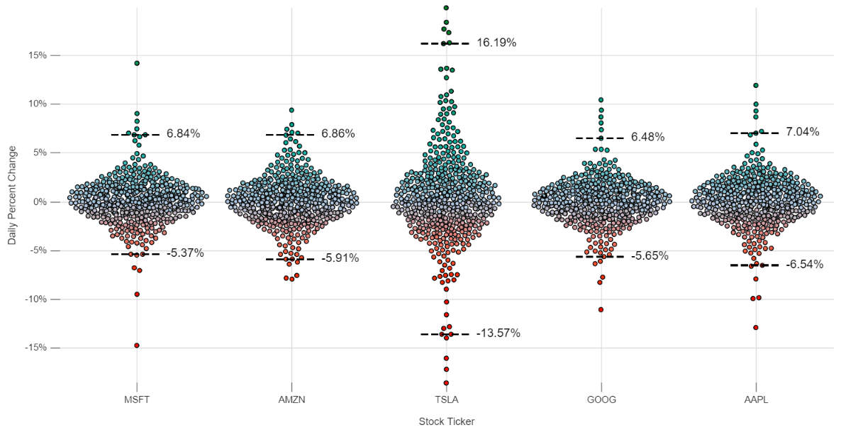
Value at Risk with React and Nivo
This tutorial introduces the Nivo package, which leverages D3 to make beautiful responsive charts in React applications. We compare daily returns for 5 popular technology stocks and introduce the concept of value at risk (VaR) used in financial market risk management.
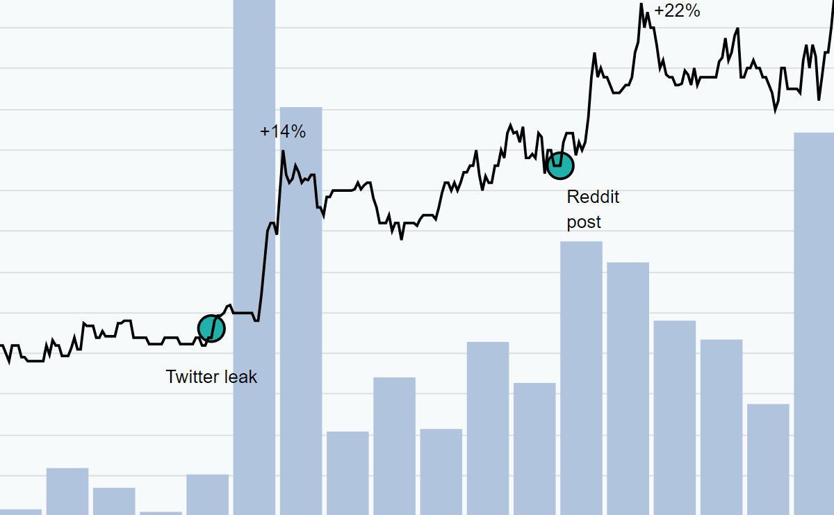
Leaked Information and Kodak Stock
On July 27 2020, information was leaked on Twitter and Reddit that a "BIG announcement" concerning Kodak and the U.S. government would be coming the next day. These charts look at the timing of the leak and the wild week of trading that ensued.

The State of the Art in Business Intelligence
An article surveying the current state of the art in business intelligence and data visualization tools and frameworks. Explores the pros and cons of options for varying levels of expertise, technical backgrounds, and budgets.
Learn how to make your data visualizations stand out.
Chartfleau has a data visualization master class for JavaScript programmers on Gumroad.
Learn MoreSocial Media
