Data Visualization in React
An Introduction to Nivo
To follow this tutorial you'll need to be familiar with Javascript, and have a basic understanding of React and web development. Otherwise it may be challenging to follow which parts of the code are plain Javascript as opposed to React-specific concepts like JSX.
What is Nivo?
I've previously written about creating swarm charts using Javascript and D3, which can be a bit complicated and tedious when it comes to configuring forces and adding labels, legends, axes and so on. There is a nice shortcut available for achieving this in a React environment. Nivo is a package that leverages D3 to make beautiful, responsive data visualizations in React applications. Despite the tremendous variety of chart types implemented in Nivo, a Google search doesn't turn up as many examples as you might expect. Perhaps that's because React and data visualization are niches themselves within the broader niche of Javascript programming. Nonetheless, this stack of technologies is a very effective way of creating data visualizations for the web.
Getting Started
If you find tutorials like this useful, or if you'd like to ask questions, please join us on Patreon.
We'll begin by creating a standard React project from the command prompt as follows:
npx create-react-app nivoswarmFor this project we'll install the @nivo/swarmplot chart module:
npm install @nivo/swarmplotWe'll install D3 as well, but just for some optional convenience functions.
npm install d3Our Data
We'll be looking at daily price movements for five popular stocks over the past 2 years. In doing so, we'll also introduce a concept from market risk management called value at risk (VaR). Our data is simply the daily stock return for each company over the past two years (500 business days), which is stored in a csv file like this:
| Date | Ticker | Return |
|---|---|---|
| 2020-07-22 | MSFT | 0.0143 |
| 2020-07-22 | TSLA | 0.0152 |
| 2020-07-22 | AMZN | 0.0122 |
| etc. | etc. | etc. |
We'll bring this into a React functional component in our app.js file by importing the csv file and opening it with D3's csv function in the useEffect hook as follows:
import React from "react";
import { useEffect, useState } from "react";
import { ResponsiveSwarmPlotCanvas } from "@nivo/swarmplot";
import csvfile from "./data.csv";
import { csv, extent, scaleLinear } from "d3";

const App = () => {
  const [state, setData] = useState({ data: [], range: [] });

  useEffect(() => {
    csv(csvfile).then((d) => {
      d.forEach((row) => (row.Return = +row.Return)); // convert strings to numerical values
      let range = extent(d.map((r) => r.Return)); // using D3's extent() for convenience
      setData({ data: d, range: range });
    });
  }, []);

  return (<div>Our chart component will go here.</div>);
};
export default App
Creating a Color Scale
In this example I want to show large loss days (-5%) in red, and large gains in green, so I'll use D3's scaleLinear() function as follows. You can add this function anywhere in your app component before the return statement.
const colorScale = scaleLinear()
    .domain([-0.05, 0, 0.05])
    .range(["tomato", "lightsteelblue", "lightseagreen"]);
The ResponsiveSwarmPlot Component
In this example I'm using Nivo's <ResponsiveSwarmPlotCanvas> component. This means our chart will be rendered to an HTML canvas, as opposed to an SVG element. Generally a canvas is more performant when rendering a large number of elements (such as this example where we have 2,500 observations), whereas an SVG element is easier to animate.
Part of the beauty of Nivo is that we could simply swap our ResponsiveSwarmPlotCanvas for a ResponsiveSwarmPlot and it would automatically render as an SVG without any other changes needed in our code. Furthermore, the chart is responsive by default, meaning that we can adjust the width of the parent container and the chart will automatically render to take advantage of that space, making this an excellent solution for web applications that will run on both desktop and mobile devices.
A couple quick "gotchas" to be aware of:
- The chart component's parent div element needs to be assigned a height, or else the chart will fail to render.
- Some chart components are very specific about the data structure passed into the data prop. Refer to the documentation and use array functions to structure your data accordingly. This can be done in the useEffect hook before setting state.
Here's the JSX returned by our App component. The Nivo documentation let's you play with a lot of these properties and see how they affect the chart responsively. I'll highlight a few of them below.
return (
          <div style={{ width: "1000px", margin: "auto" }}>
            <h1>Nivo Swarm Chart</h1>
            <div style={{ height: "600px" }}>
              {state.data.length > 0 ? (
                <ResponsiveSwarmPlotCanvas
                  data={state.data}
                  groups={["NFLX", "AMZN", "TSLA", "GOOG", "AAPL"]}
                  groupBy="Ticker"
                  value="Return"
                  identity={(d) => d.Date + " " + d.Ticker}
                  valueFormat=".1%"
                  valueScale={{
                    type: "linear",
                    min: state.range[0],
                    max: state.range[1],
                    reverse: false,
                  }}
                  colors={(d) => colorScale(d.value)}
                  size={5}
                  forceStrength={4}
                  simulationIterations={100}
                  borderWidth={1}
                  borderColor="black"
                  margin={{ top: 80, right: 50, bottom: 80, left: 80 }}
                  axisRight={null}
                  axisTop={null}
                  axisBottom={{
                    orient: "bottom",
                    tickSize: 10,
                    tickPadding: 5,
                    tickRotation: 0,
                    legend: "Stock Ticker",
                    legendPosition: "middle",
                    legendOffset: 46,
                  }}
                  axisLeft={{
                    orient: "left",
                    format: ".0%",
                    tickSize: 10,
                    tickPadding: 5,
                    tickRotation: 0,
                    legend: "Daily Percent Change",
                    legendPosition: "middle",
                    legendOffset: -55,
                  }}
                />
              ) : null}
            </div>
          </div>
        );
Some of these properties will accept a function that gets called for each data element. For example, the code below assigns the default text for tooltips:
identity={(d) => d.Date + " " + d.Ticker}Here we're using the colorScale we defined previously, and passing in the value (daily return) of each observation to set the color. Although we're using a fixed circle size (5) in this example, we could also use a function in the size property to make that dimension dynamic as well.
colors={d => colorScale(d.value)}
size={5}
At this point we already have a nice chart ready to publish. The next section will show how to add your own custom layers, which will enable you to overlay things like shapes, lines, and text on a chart.
Adding Layers
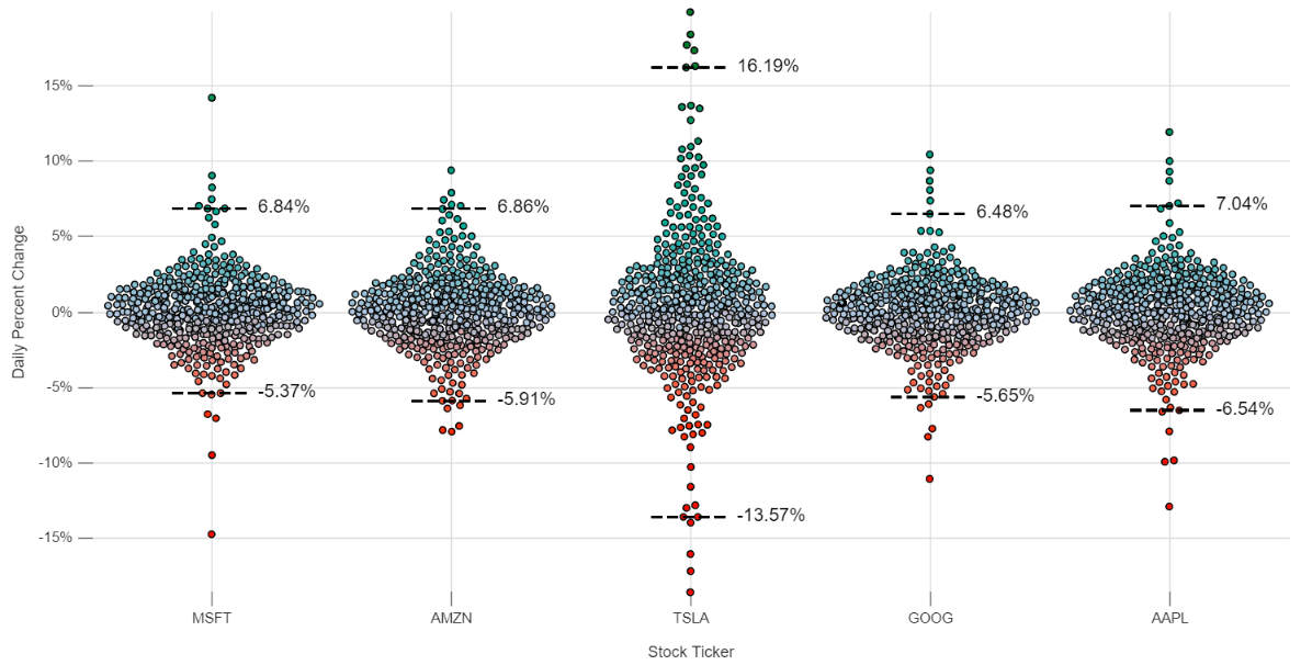
Finally, let's look at how layers can be applied to customize a chart. There's a concept in market risk management called value at risk, or VaR. The idea is to calculate the loss for a portfolio that should only be exceeded 1% of the time based on recent history (usually 2 years, or 500 days). In the case of a long stock position, it's simply the shock at the 99th percentile times the value of your holdings (ie. your equity delta).
We'll label the 99th percentile shocks for each stock on our chart to demonstrate how layers work in Nivo. Firstly, we'll add a layers property to our Nivo chart. All of these layers are rendered by default if this property is not specified. We can add our own layers and set the rendering order by adding this to the chart's props:
layers={["grid", "axes", "nodes", "mesh", "annotations", varLayer]}Writing to the Canvas
The varLayer referred to above is a function that takes the chart's HTML canvas context and allows us to draw anything we want on it. We'll add this function to App.js after the import statements. Conveniently, this function also receives our data and some useful functions in the second parameter.
In the first part of our varLayer function we'll perform some array operations on our data to get the 99th percentile shocks for each of our tickers. This is done with array functions to filter, sort, and then take the 6th and 495th observations from each 500-day vector. That leaves 1% of the observations in each tail (5 divided by 500).
const varLayer = (ctx, data) => {
  // the canvas context (ctx) is automatically passed into this
  // function with our data and certain chart properties
  let xScale = data.xScale;
  let yScale = data.yScale;
  let tickers = Array.from(new Set(data.nodes.map((d) => d.group)));

  // get the 99th percentile up and down shocks
  let valueAtRisk = [];
  tickers.forEach((ticker) => {
    // sort the shocks for each ticker
    let shocks = data.nodes
      .filter((d) => d.group === ticker)
      .sort((a, b) => {
        return a.value - b.value;
      });

    valueAtRisk.push({
      ticker: ticker,
      // our vectors have 500 observations,
      // so the 99th percentile is the 6th observation
      // on either end of the distribution (indexed from 0 to 499)
      down: shocks[5].value,
      up: shocks[494].value,
    });
  });

  // Code for writing to the canvas will go here

};
Finally, we'll take our VaR calculations and plot them on the canvas. This utilizes the standard HTML canvas API, which is basically a set of functions for drawing lines, shapes and text. w3schools provides a good reference.
Note that we call save() and restore() on our context before and after rendering, respectively, to avoid styling conflicts with the other layers. Also note that we are using a canvas here because we're rendering a <ResponsiveSwarmPlotCanvas> chart. If we were rendering the SVG version of this component, instead of working with a canvas we would return an SVG element as our layer. Since we're drawing directly on the canvas itself, there is no need to return anything in this case.
  // save our context to preserve its default state so we can restore afterward,
  // otherwise these changes may effect rendering for other layers
  ctx.save();
  ctx.fillStyle = "black";
  ctx.lineWidth = 2;
  ctx.font = "14px sans-serif";
  ctx.setLineDash([8, 4]);

  valueAtRisk.forEach((d) => {
    // label 99% down
    ctx.moveTo(xScale(d.ticker) - 30, yScale(d.down));
    ctx.lineTo(xScale(d.ticker) + 30, yScale(d.down));
    ctx.stroke();
    ctx.fillText(
      (d.down * 100).toFixed(2) + "%",
      xScale(d.ticker) + 35,
      yScale(d.down) + 3
    );

    // label 99% up
    ctx.moveTo(xScale(d.ticker) - 30, yScale(d.up));
    ctx.lineTo(xScale(d.ticker) + 30, yScale(d.up));
    ctx.stroke();
    ctx.fillText(
      (d.up * 100).toFixed(2) + "%",
      xScale(d.ticker) + 35,
      yScale(d.up) + 3
    );
  });

  // return our canvas context to it's default state
  // so as not to interfere with other layers
  ctx.restore();
We now have a chart complete with custom labels. In this example I've used a vertical layout for the value axis, which is better suited for viewing on desktops or tablets. However, you could very easily modify this for smaller devices by assigning the layout='horizontal' property and giving the parent div a larger height.

Conclusion
Nivo is an amazing package for adding responsive data visualizations to web apps. You can explore the charts and properties available to you in the documentation. A workflow that works well for building dashboards in React looks like this:
- Explore the Nivo docs for interesting visualizations and consider whether you want a canvas or svg implementation.
- Pay attention to the data structure required by the selected component, and modify data accordingly in the useEffect hook.
- Think about how you can improve the representation of your data by adding custom layers and elements.
- Add interactivity with React components such as dropdowns, input fields, click events, etc.
Finally, with some data engineering you can make your visualizations update automatically as I've done with this S&P 500 chart.
Social Media
