

CHARTFLEAU
Case Study | Real-Time Stock Portfolio Visualization
A private portfolio manager was accustomed to tracking their daily performance in cumbersome spreadsheets with hundreds of rows. It was difficult to grasp performance at a glance. Reviewing charts was consuming hours of their time daily.
They saw a visualization we had shared on social media comparing performance across S&P 500 stocks by sector. They asked if they could apply this visualization to their own stock portfolios and track prices in real time. They also wanted to use the visualization on mobile devices with smaller screens.
We developed a single-page web application using JavaScript with React, D3.js and Three.js. Building the application with React would simplify interactive functionality, and have the added benefit of enabling our client to easily integrate this component within larger applications.
To ensure smooth animation while visualizing a large number of stocks, we opted to use WebGL technology via the popular Three.js library, which leverages a device's graphics processor (GPU). This would boost performance on mobile devices like smartphones.
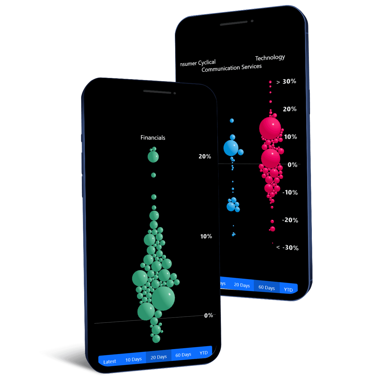
This style of visualization is often called a swarm chart. It allows for a one-to-one mapping from each item in a dataset to visual elements on screen. This makes the visualization highly intuitive, while at the same time capturing many dimensions of data in a single chart. In this case, that included:
- Portfolio identifier, or sector (horizontal axis)
- Stock return (vertical axis)
- Market capitalization (radius)
- Trading volume, or sector (color)
- Price changes over time (animation)
Making an informationally dense visualization work on small screens can be quite challenging. In this case, we would need controls for smoothly zooming and panning the visualization to avoid squeezing everything on-screen at once. Fortunately, the Three.js library makes this easy, so we didn't need to reinvent the wheel. However, we did need to ensure the axes were always visible, and that they would scale smoothly with the user's inputs.
To solve this problem we fixed the horizontal axis to the top of the screen, and the vertical axis to the right side using standard HTML and CSS. Then we allowed the user to pan freely with touch controls so the labels can enter or slide off-screen. Since the axes are positioned in "world space" within the WebGL Canvas containing the visualization, we used a technique called raycasting to project them onto screen coordinates and keep the HTML label positioning in sync.
We implemented a server using Node.js and Express to query the client's data source and stream price changes to the front-end using the WebSocket standard.
You can see a demo of this style of visualization here.
Get a free consultation on your next project:
Book a call
Social Media
